24.09.2026
We are pleased to once again teach time-based media at the Stuttgart State Academy of Art and Design and typography at the Merz Akademie this semester.
We are pleased to once again teach time-based media at the Stuttgart State Academy of Art and Design and typography at the Merz Akademie this semester.
LATEST PROJECT
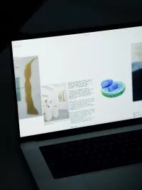
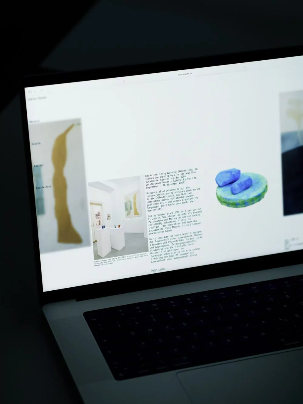
A website dedicated to preserving the work of artist Sabine Reuter (1956–2005).
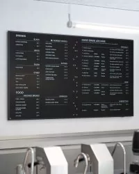
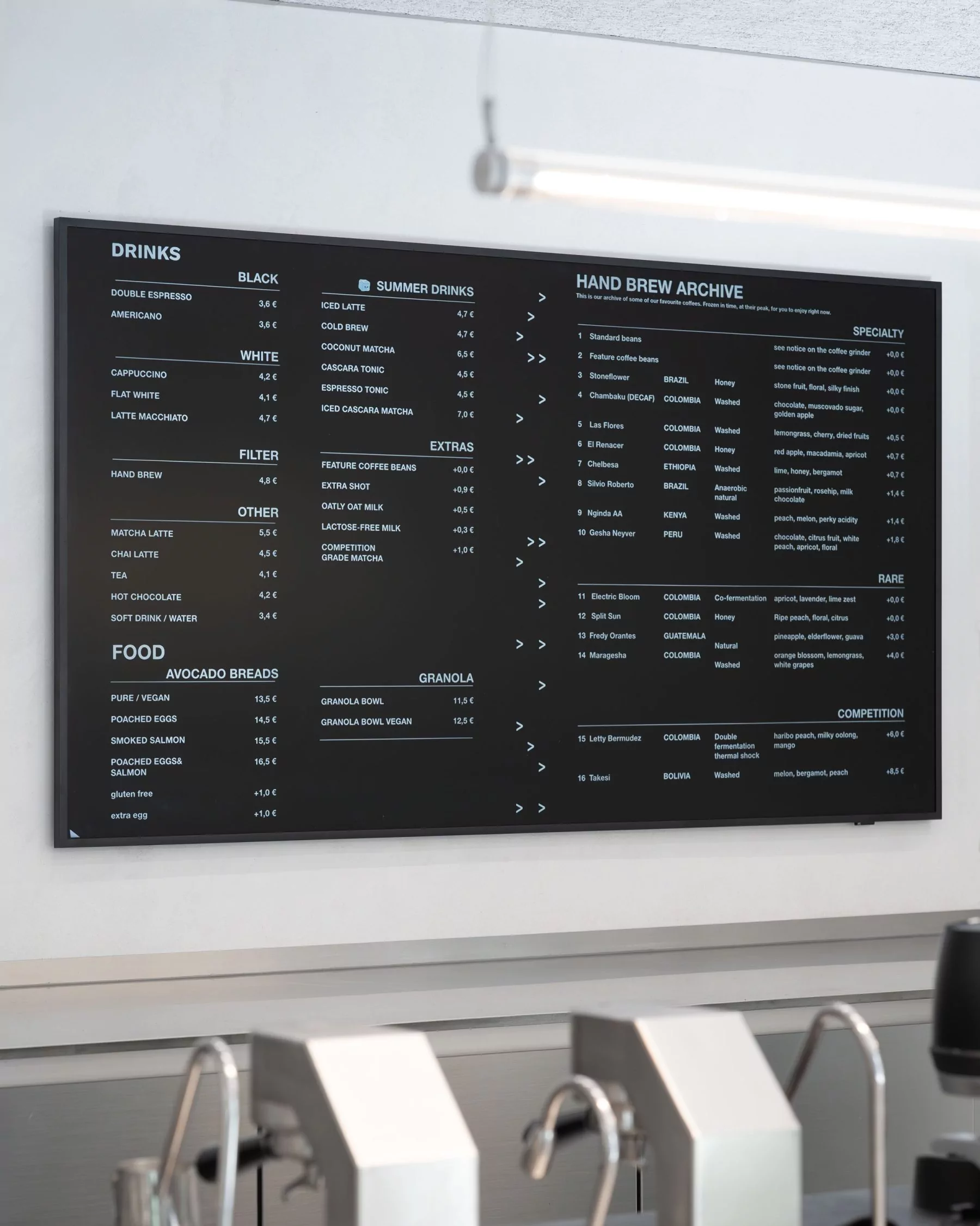
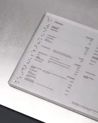
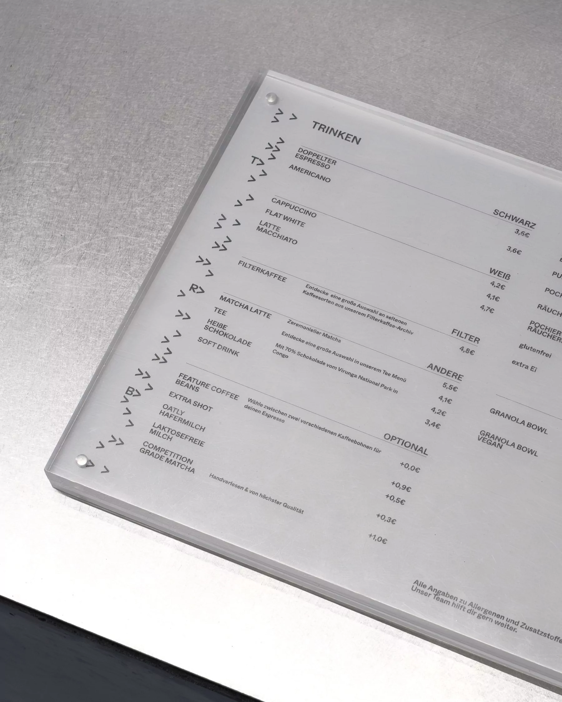
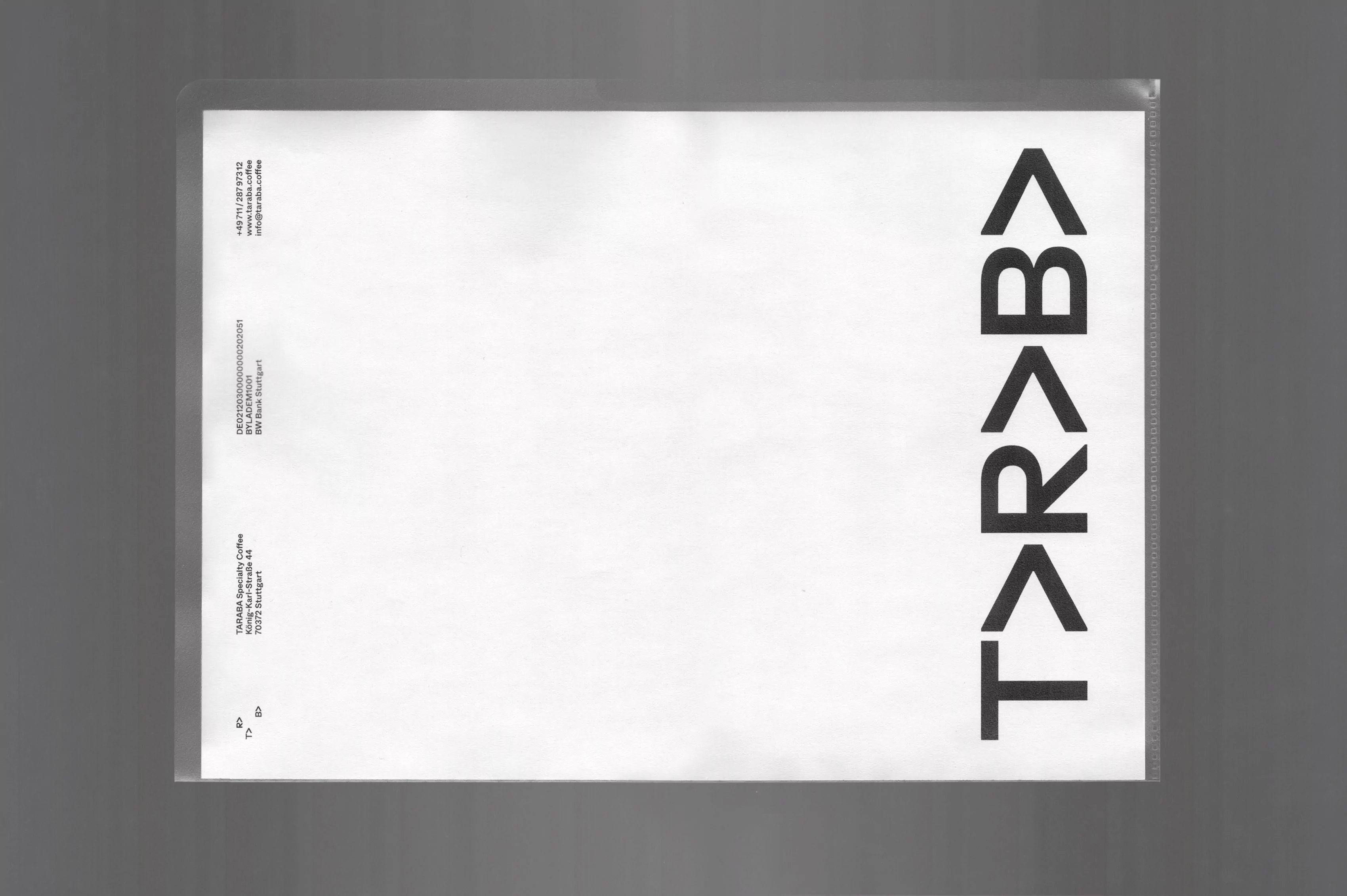
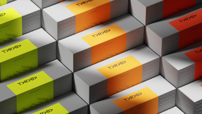
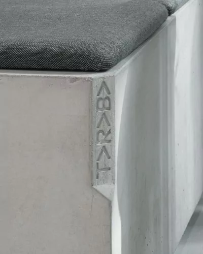
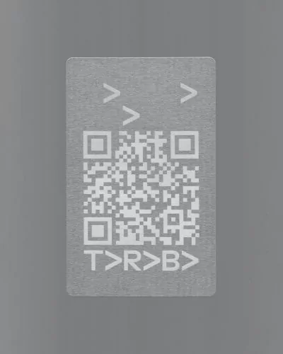
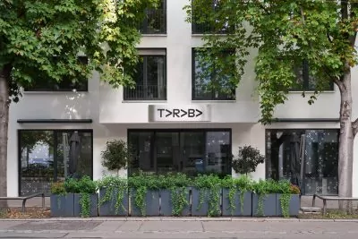
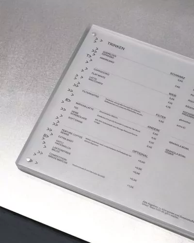
A modular visual system for a specialty coffee roaster and its cafés, based on the brand’s commitment to pushing the boundaries of coffee roasting and its pursuit of a circular supply chain.
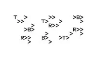
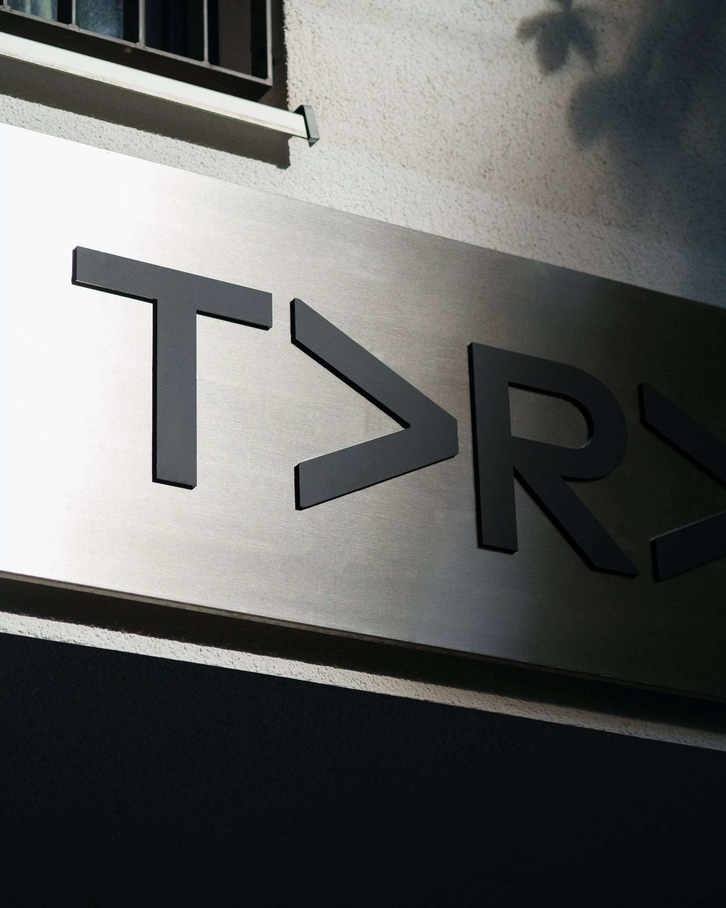
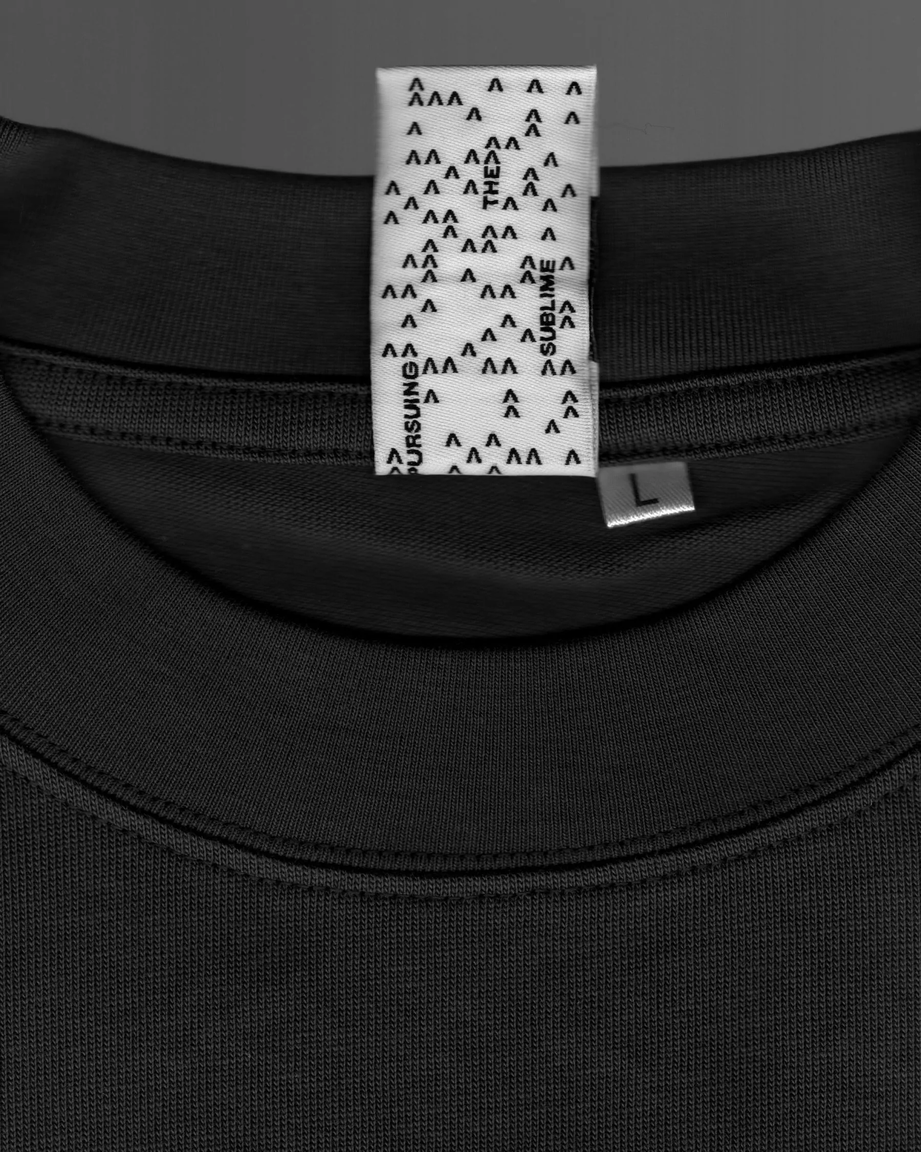
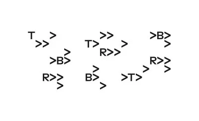
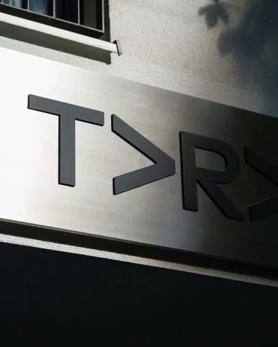
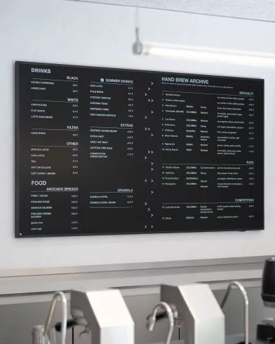
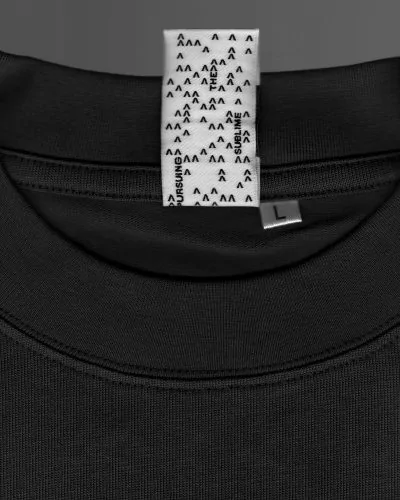
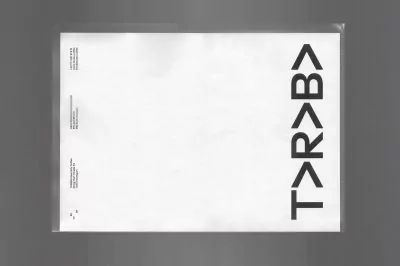
The repeating letter “A” in TARABA was transformed into arrows and expanded into a modular system. They form the core of the new identity, expressing the brand’s progressive and straightforward approach to coffee roasting.
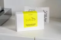
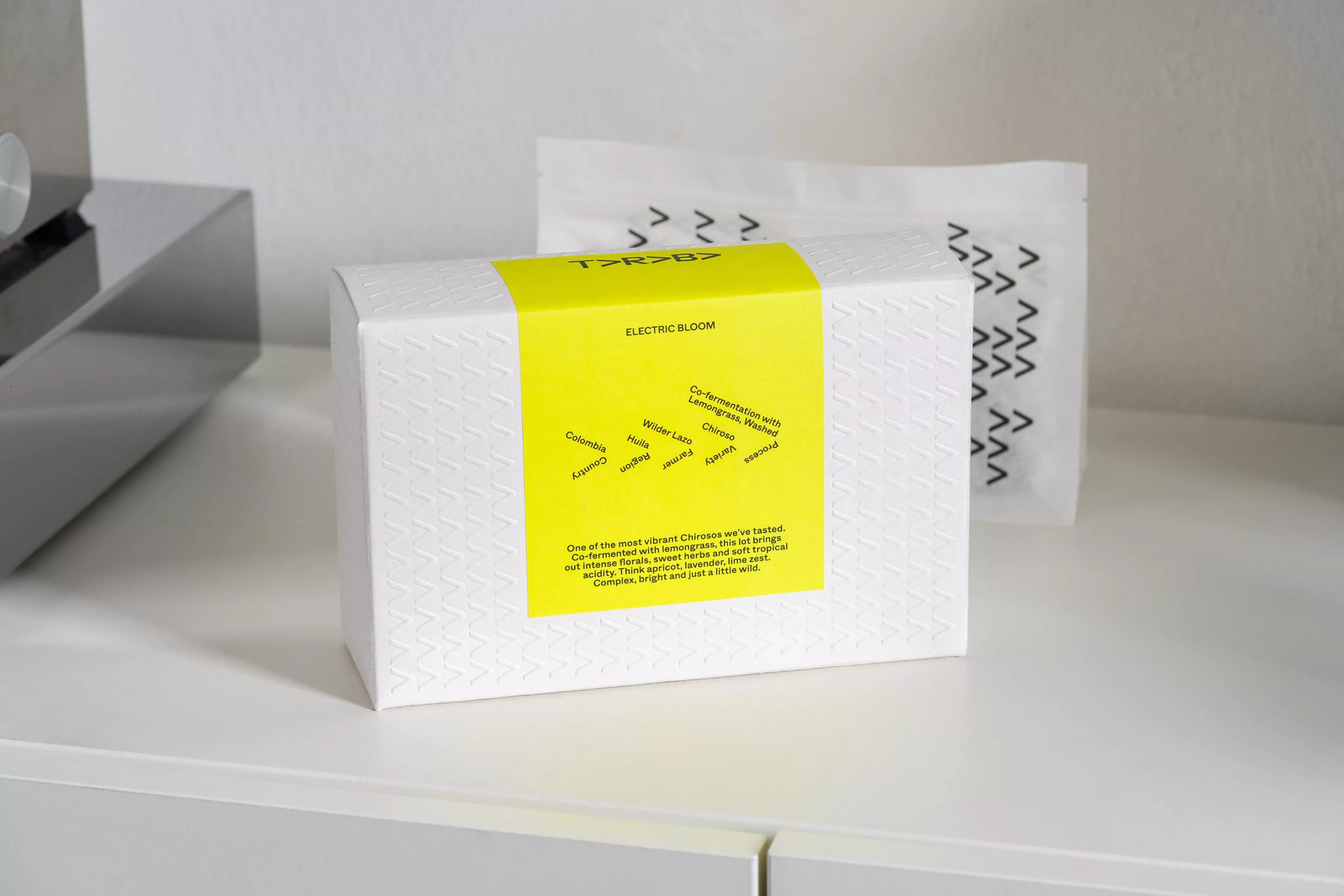
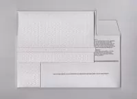
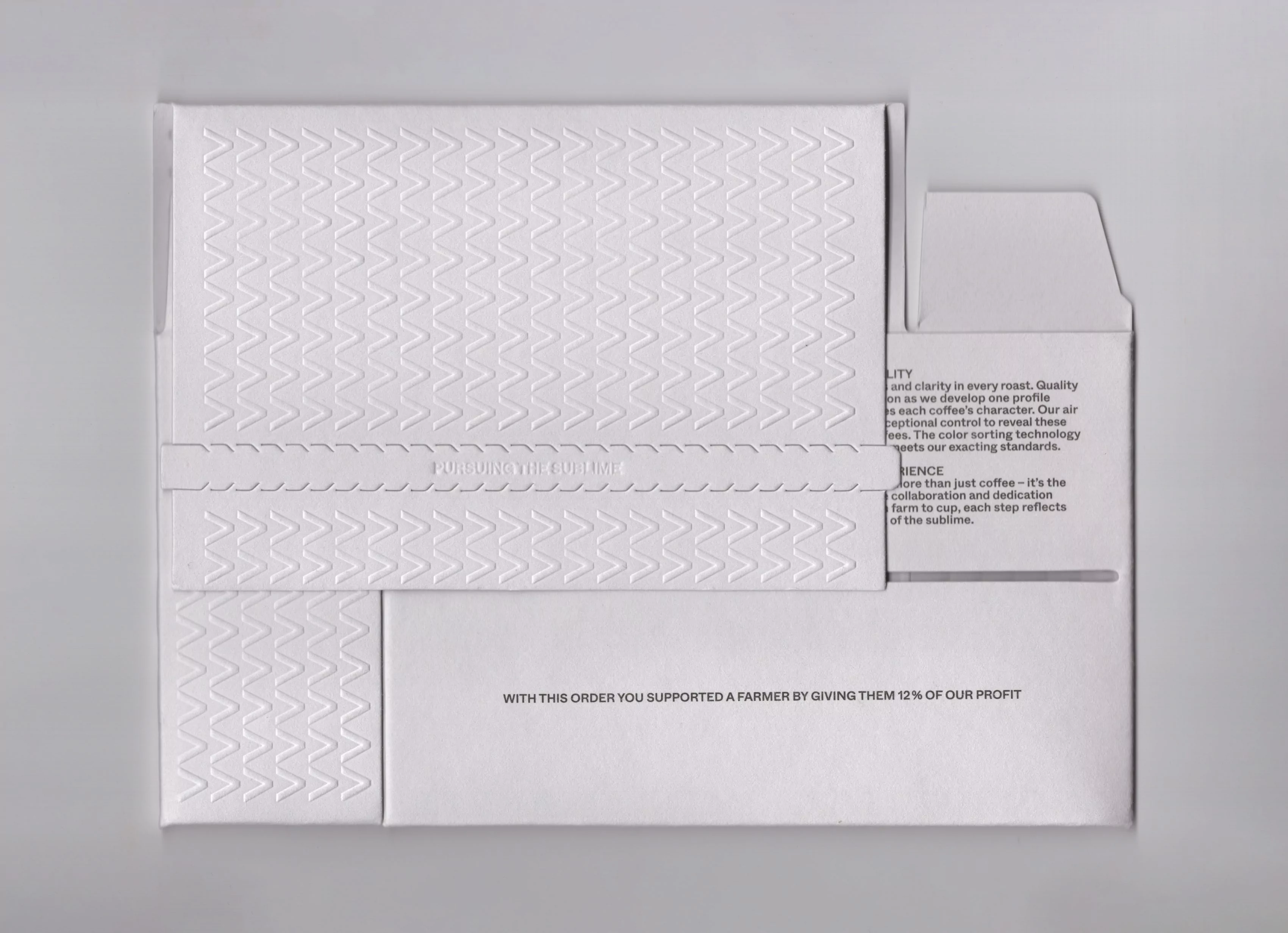
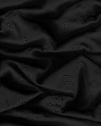
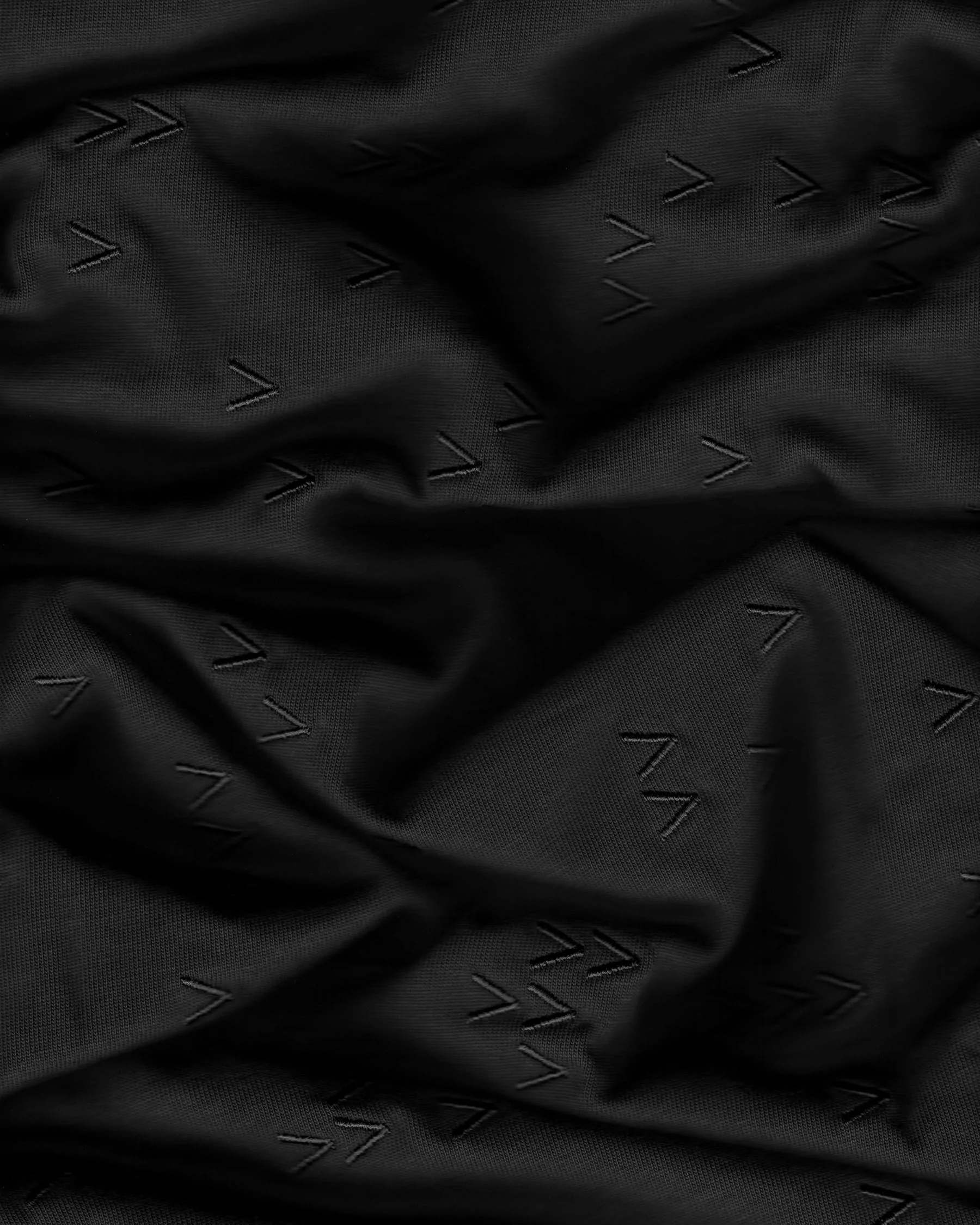
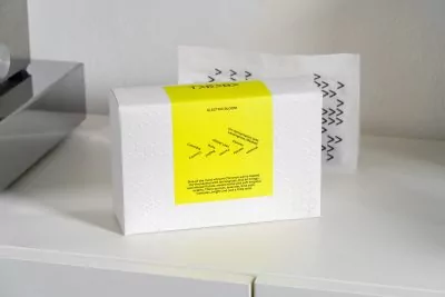
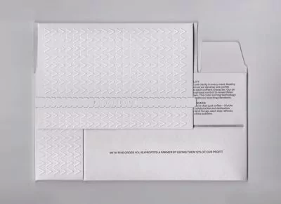
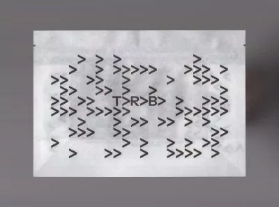
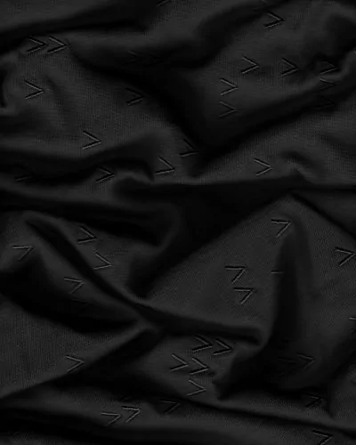
On the coffee folding box, the arrows are embossed as a continuous pattern on all sides, creating a tactile experience while illustrating the brand’s circular supply chain, in which revenues are shared with farmers.
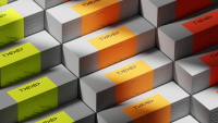
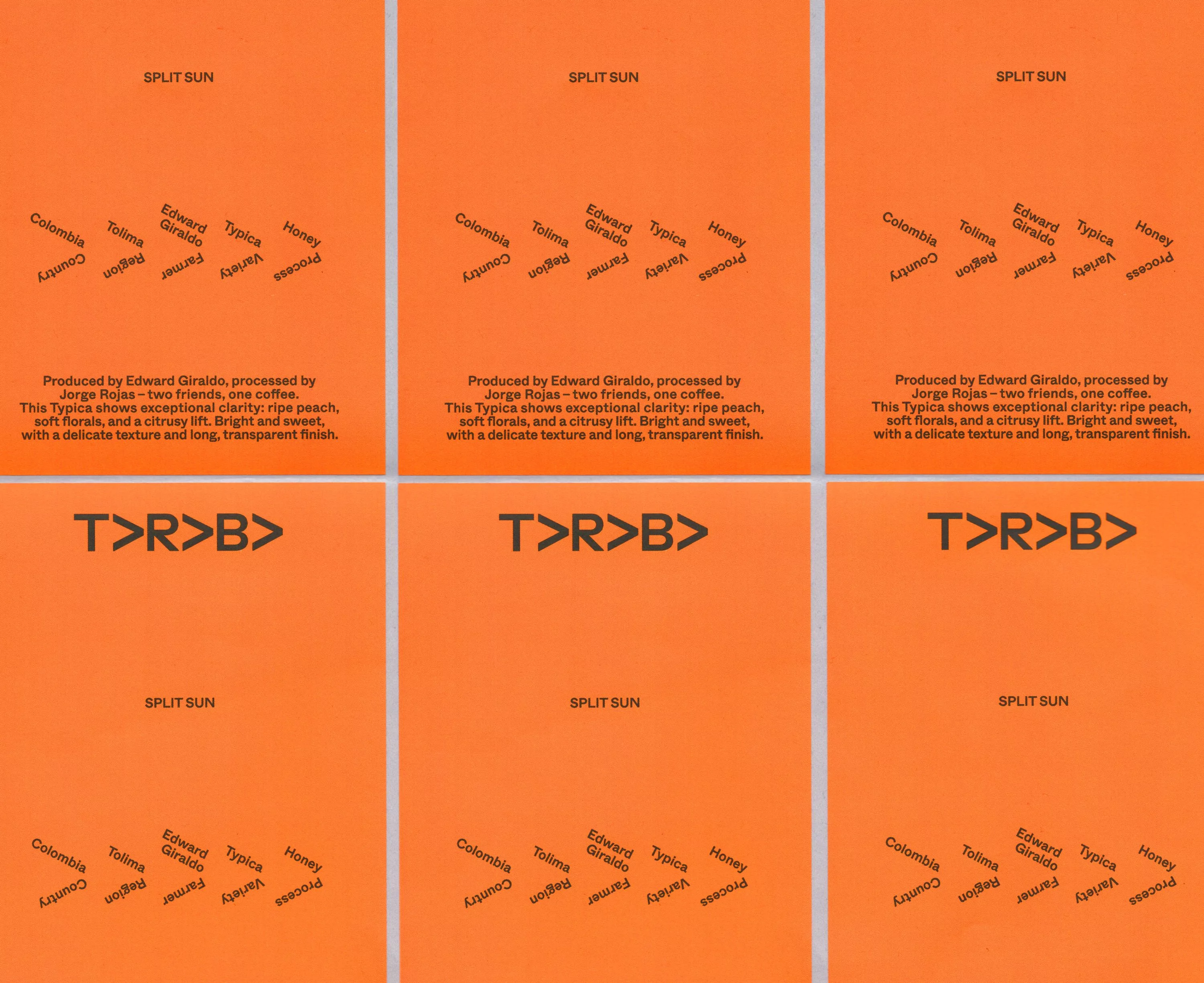
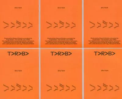
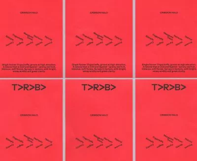
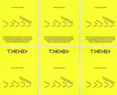
The variety labels playfully reference the arrows by setting the coffee specifications at the same angle, turning the information itself into an arrow and reinforcing the brand identity.
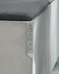
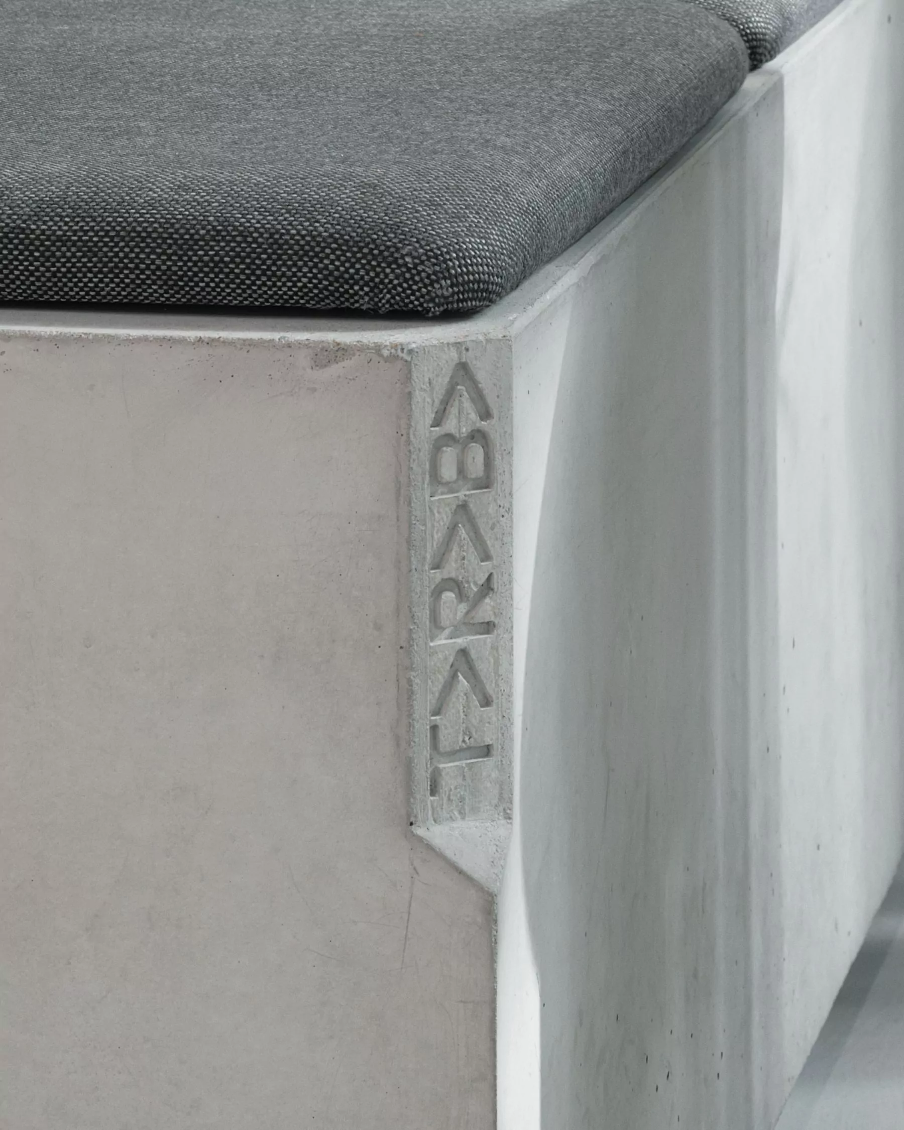
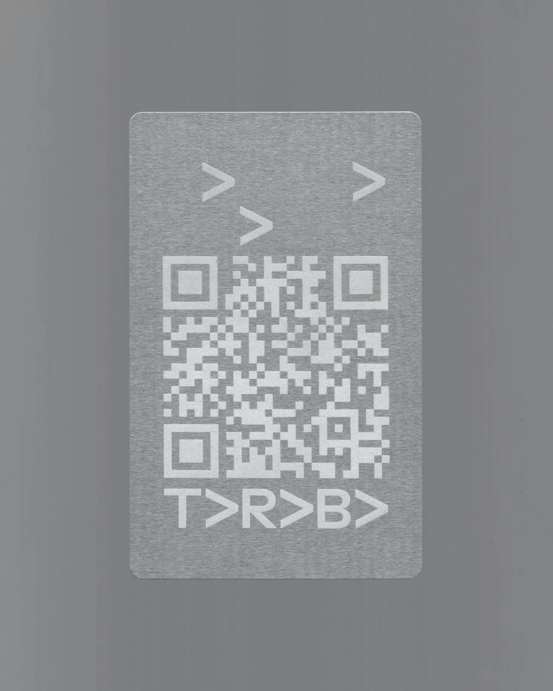
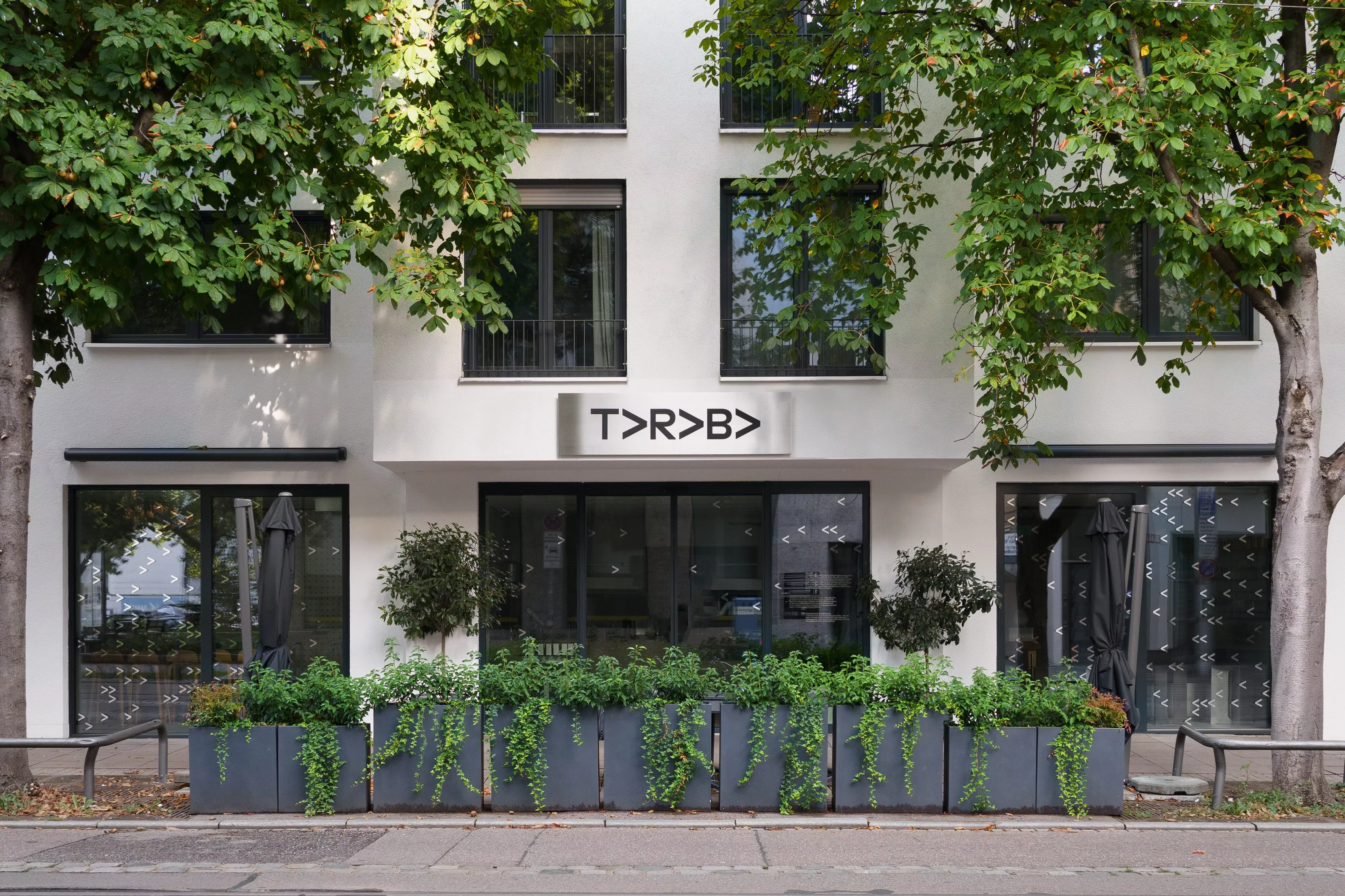
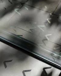
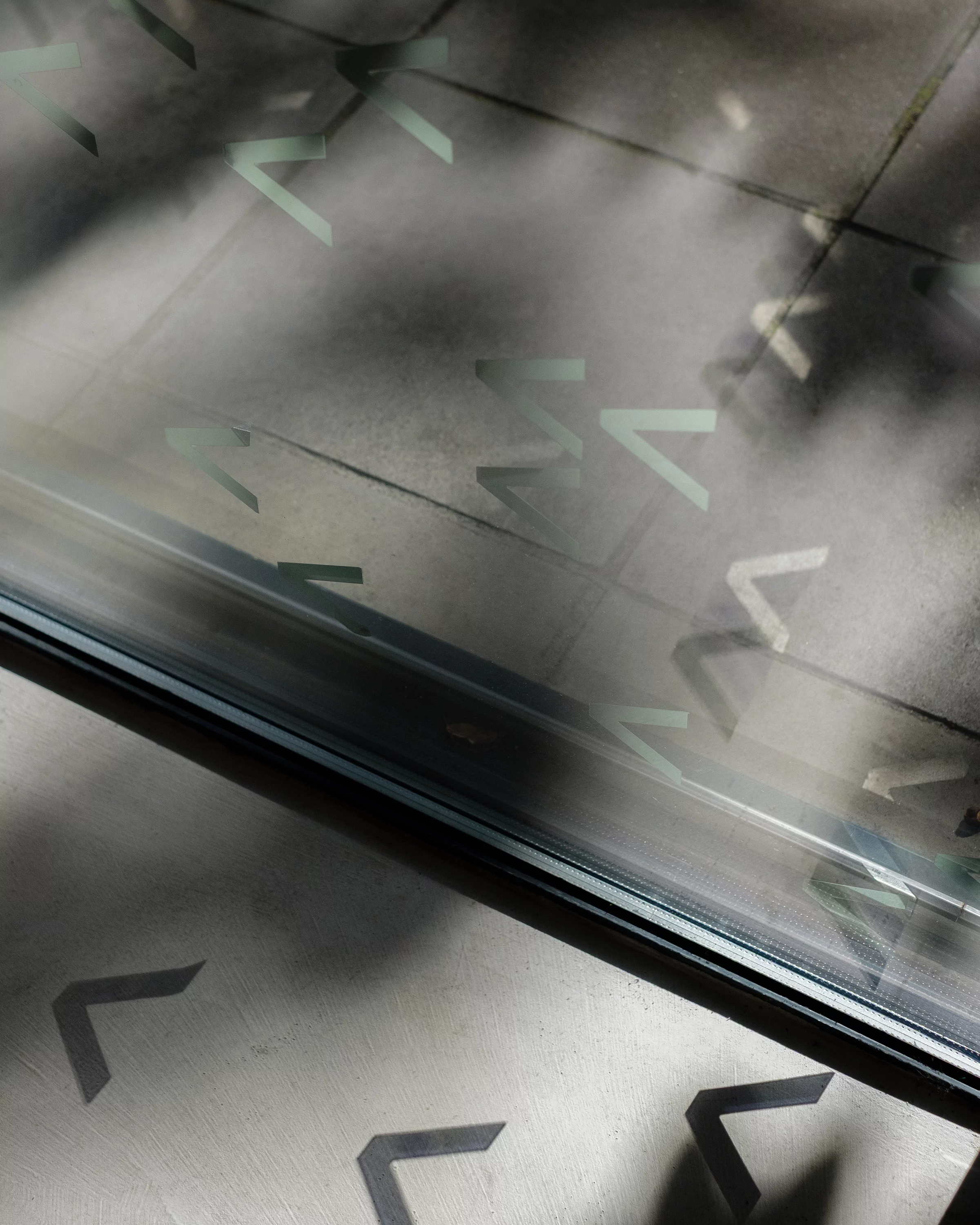
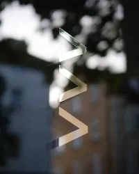
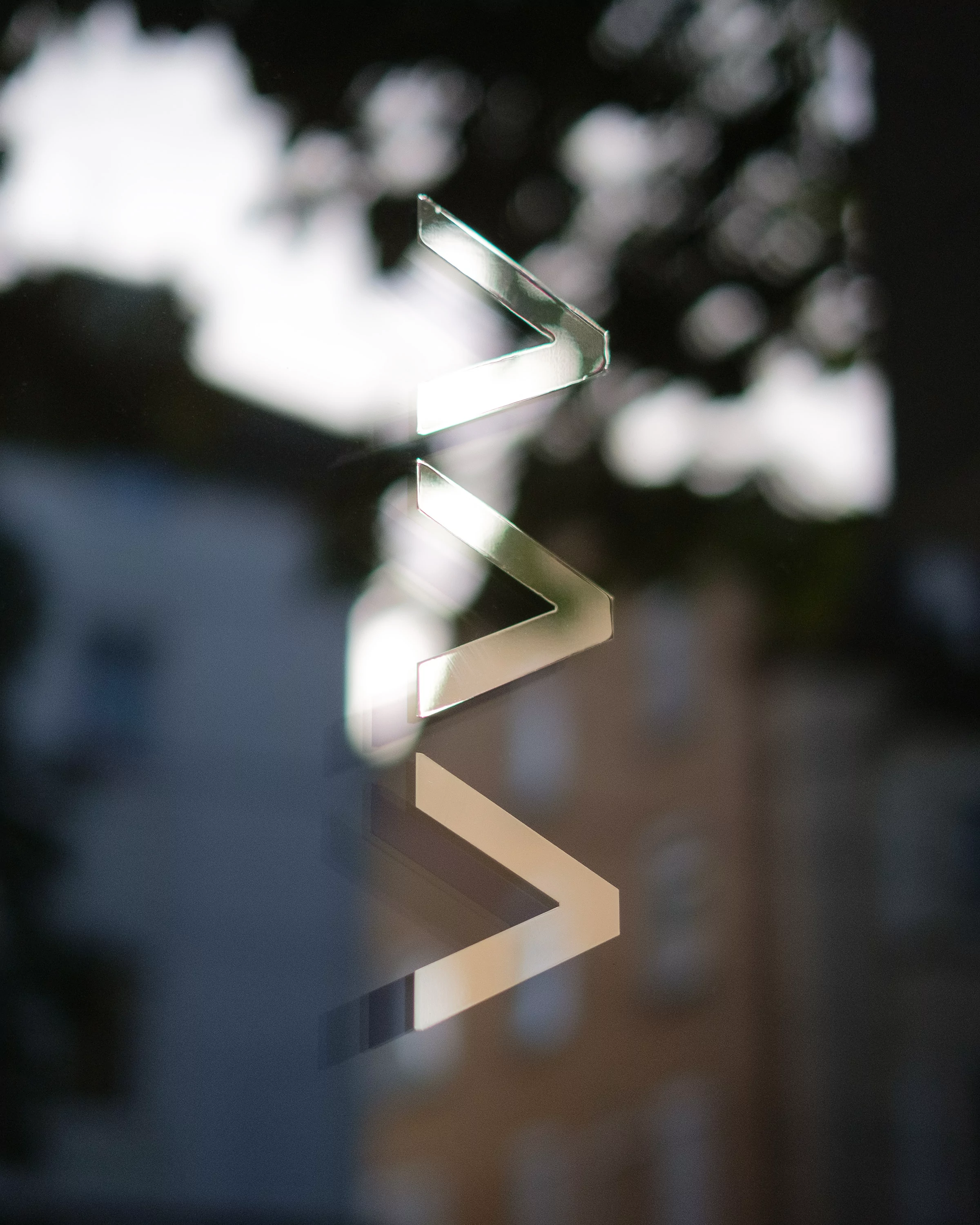
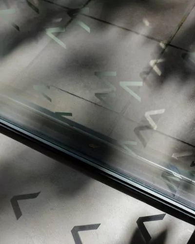
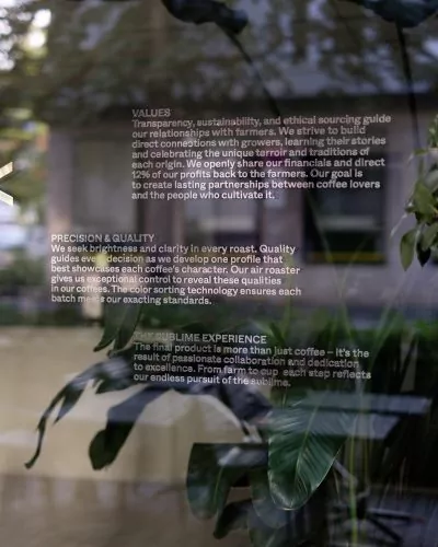
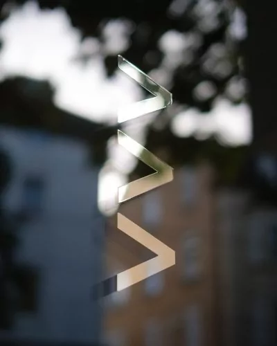
In addition to providing collision protection, the arrows set in mirrored foil extend the brand into the café and the surrounding urban space, appearing as shadows inside and reflections outside. They are arranged to subtly point toward the café entrance, with their density decreasing closer to the door.
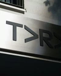
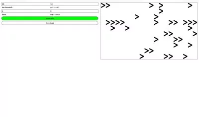
A generator was developed to make creating different logo patterns easy, allowing control over area proportions and arrow density.
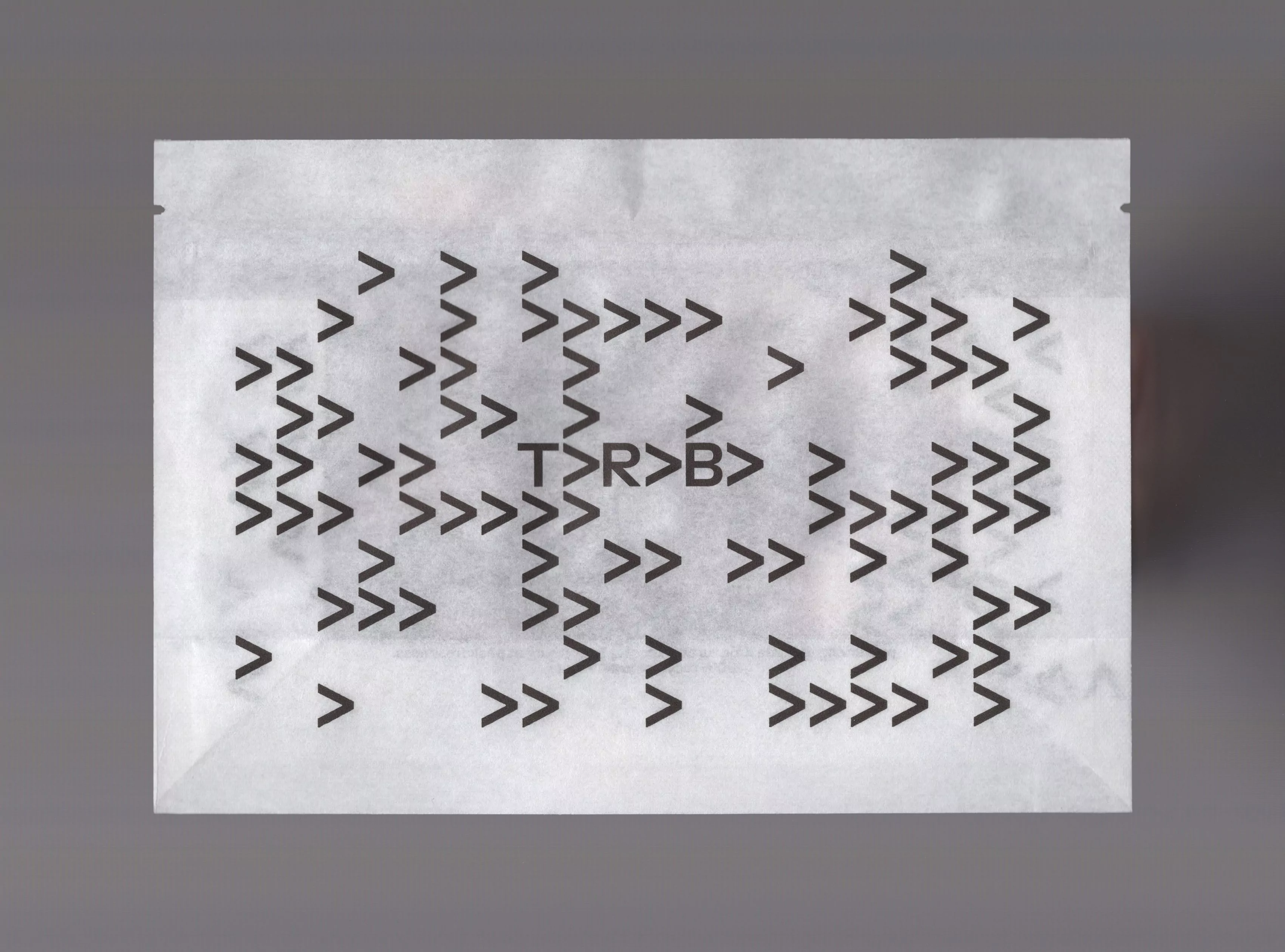
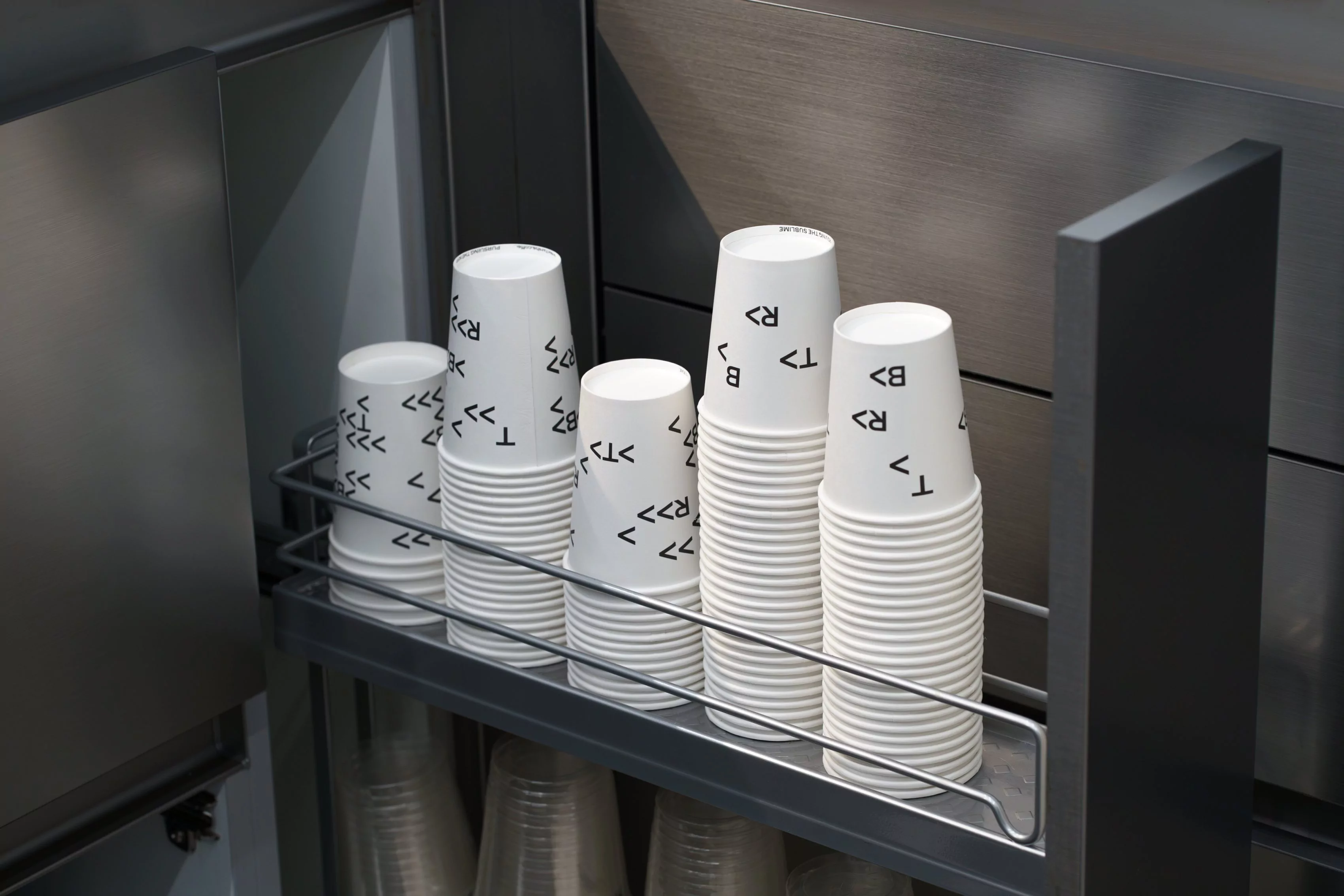
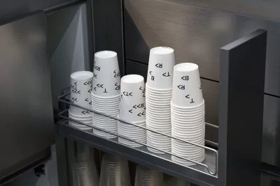
Like on the folding box and pouch, the circular arrow system appears as a repeating pattern on the to-go cups, keeping the brand visible from any angle. The number of arrows adjusts with the cup’s volume, ensuring both clear distinction between sizes and design versatility.
A modular visual system for a specialty coffee roaster and its cafés, based on the brand’s commitment to pushing the boundaries of coffee roasting and its pursuit of a circular supply chain.
The repeating letter “A” in TARABA was transformed into arrows and expanded into a modular system. They form the core of the new identity, expressing the brand’s progressive and straightforward approach to coffee roasting.
On the coffee folding box, the arrows are embossed as a continuous pattern on all sides, creating a tactile experience while illustrating the brand’s circular supply chain, in which revenues are shared with farmers.
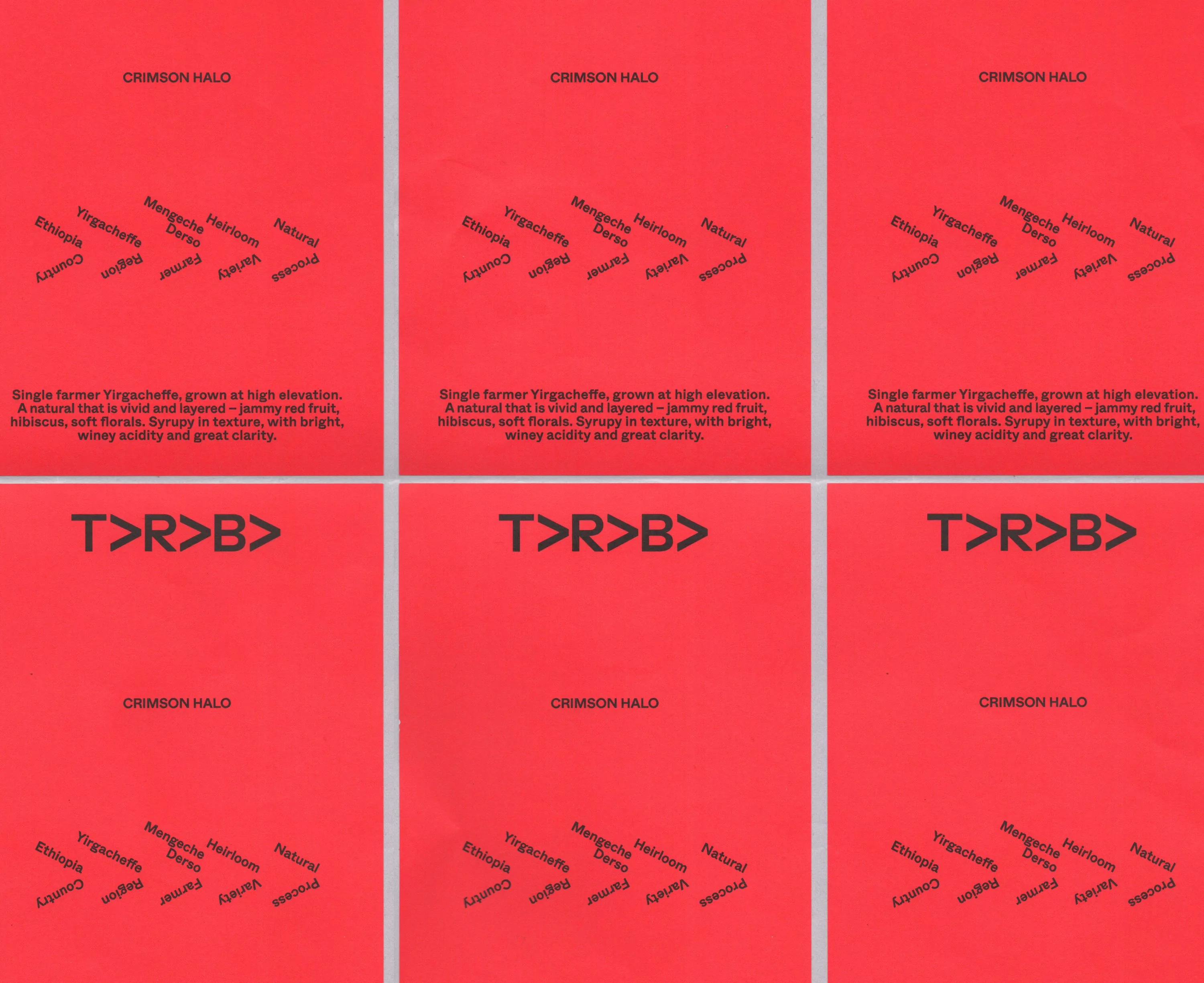
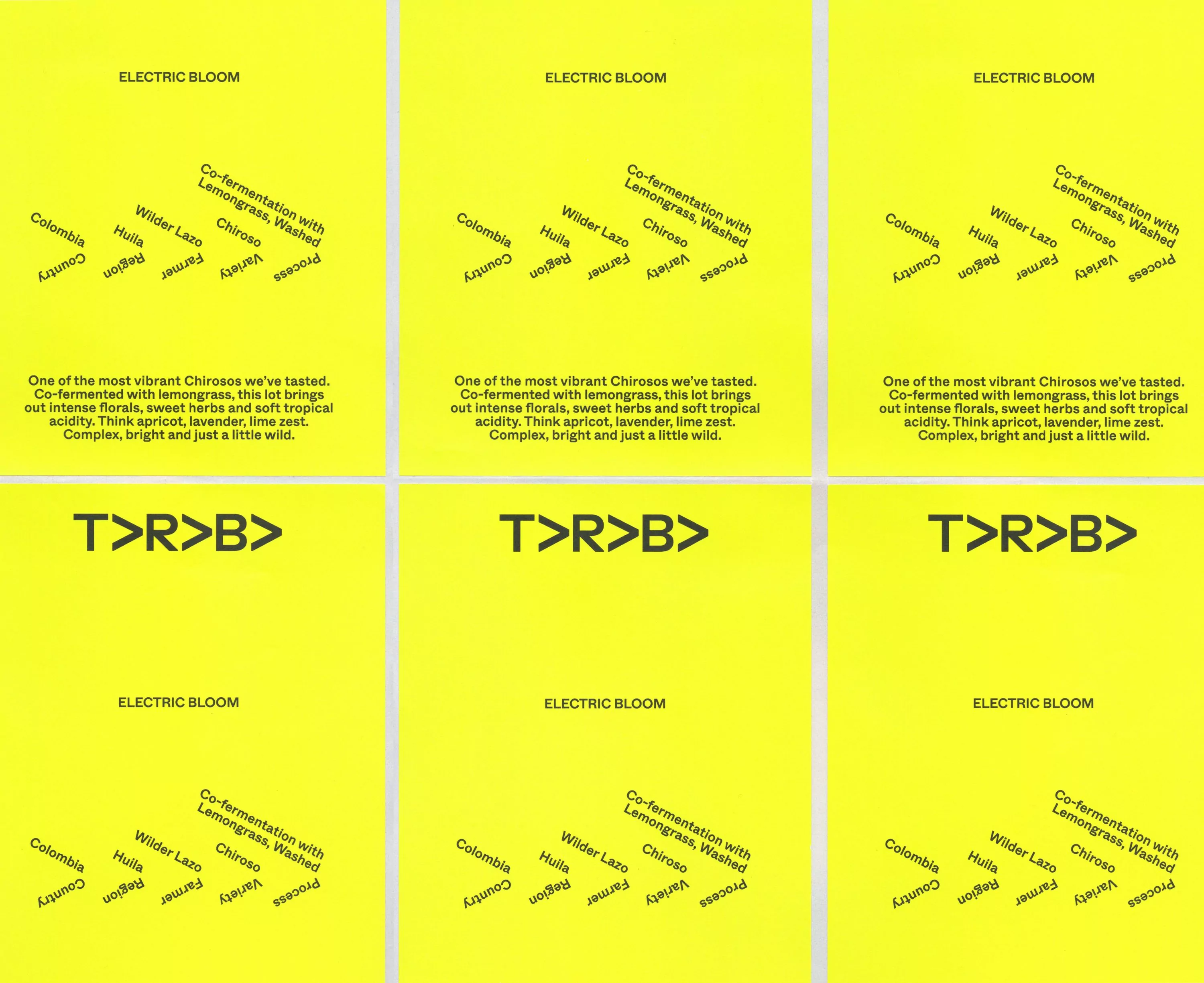
The variety labels playfully reference the arrows by setting the coffee specifications at the same angle, turning the information itself into an arrow and reinforcing the brand identity.
In addition to providing collision protection, the arrows set in mirrored foil extend the brand into the café and the surrounding urban space, appearing as shadows inside and reflections outside. They are arranged to subtly point toward the café entrance, with their density decreasing closer to the door.
A generator was developed to make creating different logo patterns easy, allowing control over area proportions and arrow density.
Like on the folding box and pouch, the circular arrow system appears as a repeating pattern on the to-go cups, keeping the brand visible from any angle. The number of arrows adjusts with the cup’s volume, ensuring both clear distinction between sizes and design versatility.
| {{{ date.Y }}} | {{{ title }}}{{# has_multiple_projects }} ({{ project_count }}×){{/ has_multiple_projects }} |
|---|