16.11.2026
LATEST CASE
Playful geometric identity based on visual harmony rather than mathematical precision.
Case
LATEST CASE
Playful geometric identity based on visual harmony rather than mathematical precision.
We are very much looking forward to teach typography at the Merz Akademie and time-based media at the Stuttgart State Academy of Art and Design again this semester.
LATEST PROJECT
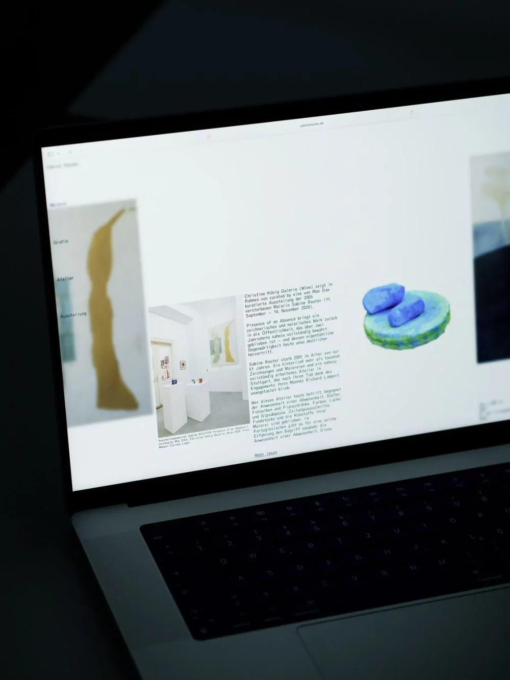
A website dedicated to preserving the work of artist Sabine Reuter (1956–2005).
A modular and versatile name forms the basis of a variable identity for an architecture start-up that develops spaces and processes that lead to climate-friendly buildings and livable cities.

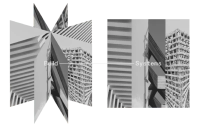
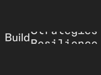
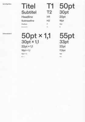
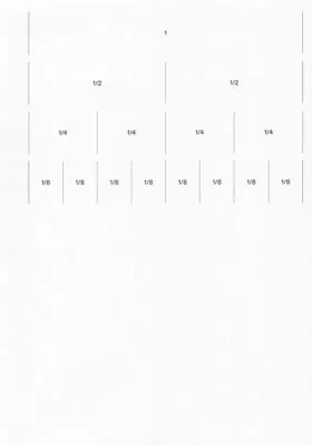
The newly created name forms the core of the brand identity and can be adapted to various concepts and approaches in architecture. It reflects the company’s core expertise in the construction industry while also conveying its focus on developing strategic and structured frameworks that optimise processes and enhance efficiency. The modular nature of the name allows it to be combined with different terms, emphasizing various aspects of the company’s agenda.


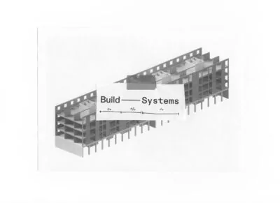
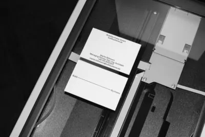
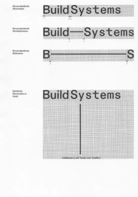
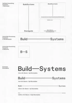
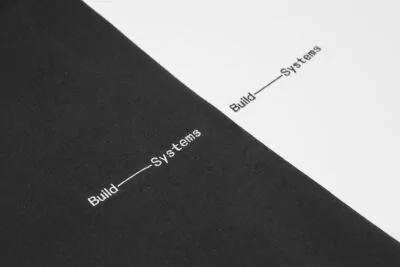
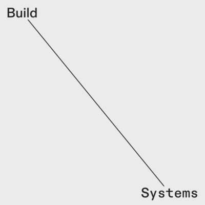
In different applications, a simple dash is used to highlight the systematic approach and the two core themes of the company.


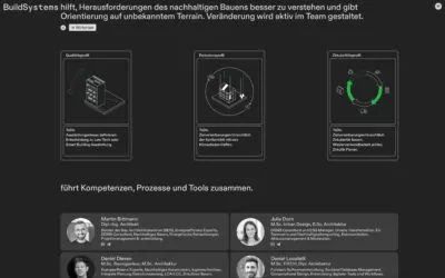
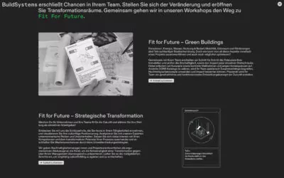
On the website, the word mark not only functions as an identity-forming element but also as part of the brand promises.


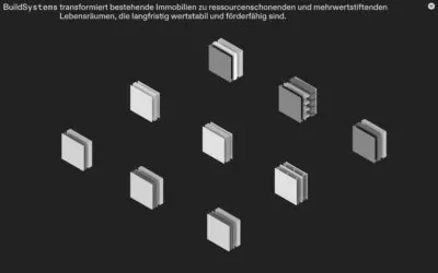
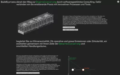
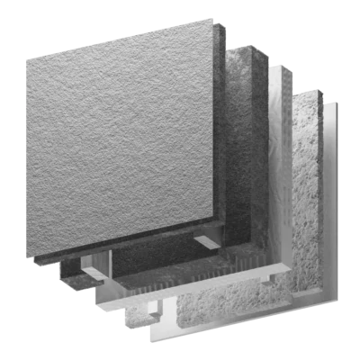
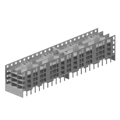
Various 3D animations help to explain the complexity and the process of sustainable construction.


A modular and versatile name forms the basis of a variable identity for an architecture start-up that develops spaces and processes that lead to climate-friendly buildings and livable cities.
The newly created name forms the core of the brand identity and can be adapted to various concepts and approaches in architecture. It reflects the company’s core expertise in the construction industry while also conveying its focus on developing strategic and structured frameworks that optimise processes and enhance efficiency. The modular nature of the name allows it to be combined with different terms, emphasizing various aspects of the company’s agenda.
In different applications, a simple dash is used to highlight the systematic approach and the two core themes of the company.
On the website, the word mark not only functions as an identity-forming element but also as part of the brand promises.
Various 3D animations help to explain the complexity and the process of sustainable construction.
| {{{ date.Y }}} | {{{ title }}}{{# has_multiple_projects }} ({{ project_count }}×){{/ has_multiple_projects }} |
|---|